Choosing a Theme vs Building Your Own Design
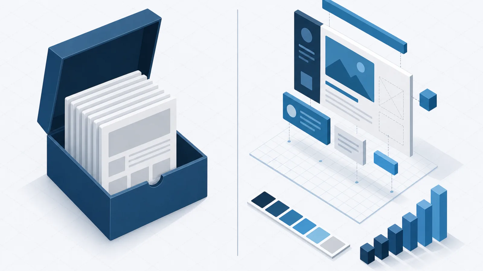
A theme is not the cheap option and custom is not the good option. What each actually costs over three years, and the honest test for which one your product needs.
The short version
- The real cost of a theme is not the licence. It is the accumulating friction of every requirement the theme did not anticipate.
- The real cost of custom is not the design phase. It is owning every component, state and edge case forever.
- The middle path — a headless component library plus your own visual layer — is right for most products and gets considered least.
- Ask whether design is a differentiator for your product. If a competitor could copy your interface and gain nothing, buy it.
The question is usually framed as budget: a theme is cheap, custom is expensive, pick according to funding. That framing produces bad decisions in both directions, because it prices the purchase rather than the ownership.
What follows is a more useful way to decide.
What a theme actually gives you
A well-built commercial theme is not a set of pretty pages. It is a large body of solved problems: responsive behaviour across breakpoints tested on real devices, accessible form controls, loading and empty and error states, cross-browser quirks handled, print styles, dark mode, and a component inventory far broader than a small team would build unprompted.
That last point is the one people miss. A theme includes the components you have not thought about yet — the pagination control, the multi-select, the date range picker, the toast. Building those on demand, one at a time, under deadline, is how design systems become inconsistent.
What it costs
The friction is cumulative rather than sudden, and it shows up in a recognisable sequence.
First, minor divergence. A requirement the theme almost supports, met with a small override. Then the overrides accumulate, each reasonable in isolation. Then a theme update conflicts with the overrides, so you stop updating. Now you own a fork of a codebase you did not write and do not fully understand.
The other costs:
- Weight. Themes ship for everyone, so you carry components you will never render. This is fixable with disciplined build tooling and usually is not fixed.
- Recognisability. Popular themes are visibly popular. For a consumer product where brand matters, looking like several thousand other products is a genuine cost.
- Constrained information architecture. Themes assume a page structure. Products that do not match it end up shaped by the theme rather than by the problem.
What custom actually gives you
An interface that fits your product exactly, a brand that is yours, and no ceiling on what you can express. When the interface is the product — a design tool, a creative application, anything where the experience is the reason people choose you — this is not a preference, it is a requirement.
What it costs
Far more than the design phase, which is the part everyone budgets for. What follows the handoff:
- Every state of every component. Default, hover, focus, active, disabled, loading, error, empty. A design file typically shows one or two; production needs all of them.
- Accessibility. Keyboard navigation, focus management, screen reader semantics, contrast, reduced motion. Getting a custom dropdown or modal genuinely accessible is much harder than it looks and is where custom implementations most commonly fail.
- Responsive behaviour at every breakpoint, on real devices.
- Documentation and governance, or the system fragments within a year as different developers solve the same problem differently.
- Ongoing ownership. There is no vendor shipping fixes. Every bug is yours.
Custom design projects rarely fail at launch. They fail in month nine, when the original designer has moved on, three developers have each implemented a slightly different button, and nobody can say which is correct because the documentation was the thing that got cut.
The middle path most teams should take
The framing as a binary is the actual problem. There is a third option that gets considered far less than it deserves: headless component libraries — Radix, Headless UI, Ark and their equivalents.
These provide behaviour and accessibility with no visual opinion at all. The dropdown handles keyboard navigation, focus trapping, screen reader announcements and positioning; it has no styling whatsoever. You supply all of the appearance.
What that combination buys:
- Genuinely accessible interactive components without solving those problems yourself.
- Complete visual freedom — the design is entirely yours.
- No fighting a vendor’s aesthetic, because there is not one.
- A much smaller surface to maintain than a full custom system.
Pair that with your own design tokens — colour, type scale, spacing, radius, shadow — and a utility CSS layer, and you get a distinctive product with a fraction of the ownership burden. For most SaaS products, this is the right answer, and it is the one that gets skipped because the conversation was framed as buy-or-build.
An honest decision test
Four questions. They resolve most cases.
- Is the interface a reason people choose you? If a competitor cloned your UI exactly and gained nothing, design is not your differentiator and you should buy as much of it as possible.
- Who maintains it in two years? If the answer is a team of one, or nobody yet identified, custom is a liability. Themes and headless libraries both have someone else shipping fixes.
- How unusual is your information architecture? A conventional dashboard-and-forms product fits a theme comfortably. Something genuinely novel will fight one continuously.
- What is your actual accessibility obligation? If you sell to government, education or enterprise, WCAG conformance is contractual. Custom components are where that goes wrong, and remediating them later is expensive.
If you take a theme, do it deliberately
Most theme regret comes from using one carelessly rather than from the choice itself.
- Set a customisation budget up front. Decide what proportion you will override and treat exceeding it as a signal to reconsider, not as a normal Tuesday.
- Override through the theme’s extension points, never by editing its source. This is what preserves your ability to update.
- Establish your tokens first. Map your brand onto the theme’s variables before writing any custom CSS. A surprising amount of differentiation is available through colour, type and spacing alone.
- Prune what you do not use. Configure the build to drop unused components rather than shipping the entire library.
- Review annually. Ask whether the theme is still helping. When the honest answer is no, plan a migration rather than continuing to override.
Boolean Solutions experience with this decision
We design and build both ways, and we have inherited plenty of projects where the choice went badly. The most common failure by a wide margin is the theme that was customised past the point of recognition — the team paid for a theme, then paid again for the custom work, and ended up with something harder to maintain than either option would have been.
The second most common is a beautiful custom design system with no keyboard support, discovered during an enterprise procurement review.
If you are making this decision, talk to us — a short conversation about your actual constraints tends to resolve it quickly.
Further reading
- Radix Primitives — the reference implementation of the headless approach
- ARIA Authoring Practices Patterns — what each interactive component actually has to do; read this before building any of them
- Atomic Design — Brad Frost on structuring a design system so it survives
- Design Tokens Community Group — the token layer that makes either approach maintainable

Udit Mittal
Founder at Boolean Solutions. Twenty years of building and rescuing web, mobile and AI products for SaaS companies and startups — and writing down what actually worked.
Get in touch