
Using Midjourney for Quality Image Generation
Getting one striking image is easy. Getting forty that look like they came from the same studio is the actual skill, and it comes down to constraint, not cleverness.

The short version
- The hard problem is consistency across a set, not quality of a single image. Solve for the set.
- Write prompts as a specification with fixed and variable parts, and change only the variable part between images.
- Style references and parameters do more for coherence than any amount of adjective stacking.
- Budget for post-processing. Generation gets you 85% of the way; cropping, cleanup and compression are still your job.
Generating a striking image takes about ninety seconds and very little skill. Generating forty images that look like they came from the same art director, over several weeks, matching a brand you already have, is a different exercise entirely — and it is the one that actually comes up in commercial work.
Everything below is oriented to that second problem.
Prompts are specifications, not wishes
The most common mistake is writing a prompt as a description of a mood and hoping for the best. A prompt that produces repeatable output reads more like a brief, with each dimension named explicitly.
The dimensions worth stating every time:
- Subject — what is in frame, concretely, including relative positions.
- Medium and technique — isometric 3D render, flat vector, oil painting, editorial photograph. This does more work than any other single word.
- Composition — camera angle, framing, where negative space sits. If the image will carry overlaid text, ask for the empty region.
- Lighting — soft diffuse, hard directional, rim lit, flat ambient.
- Palette — named colours, ideally with hex values. Models do not honour hex precisely but it constrains the range noticeably.
- Exclusions — what must not appear. For anything commercial this almost always includes text, since generated lettering is unreliable and rarely usable.
Structure the result as a fixed prefix that never changes across the set, and a short variable clause that describes only this particular image. That single discipline produces more coherence than any other technique.
Adjective stacking does not work. Adding “stunning, beautiful, masterpiece, 8K, award-winning” to a prompt mostly wastes tokens. Specific nouns describing medium, lighting and composition change the output far more than superlatives do.
Parameters that matter for consistency
Three levers carry most of the weight:
Style reference. Passing an existing image as a style reference, with a weight controlling how strongly it applies, is the most direct route to a consistent set. Generate one image you are happy with, then use it as the reference for everything that follows. This is the single most useful feature for series work.
Stylise. This governs how much aesthetic opinion the model applies over your instructions. Low values follow the prompt more literally and produce plainer results; high values are more attractive and less obedient. For technical or diagrammatic illustration, lower is usually correct — you want your composition, not the model’s.
Aspect ratio. Set it to your final ratio at generation time rather than cropping later. Composition is generated to fill the frame, and cropping a square to 16:9 reliably removes the part that made it work.
Seeds are worth knowing about but less useful than they sound. They help reproduce a specific result; they do not transfer style between different subjects.
Working a set, not an image
The workflow that has worked well for us on illustration sets:
- Establish the style on the hardest subject first. Iterate until one image is genuinely right. This may take twenty attempts and it is the investment that pays for the rest.
- Freeze the prefix. Once that image exists, extract everything about it that should be constant and never edit that part again.
- Generate the rest with a style reference to the first, varying only the subject clause.
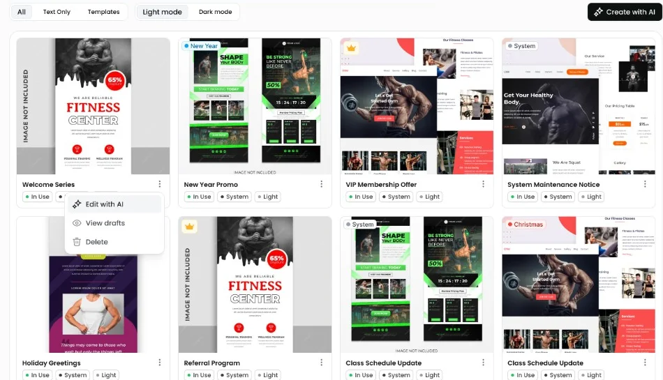
- Review as a grid, not individually. Put all outputs side by side at thumbnail size. Inconsistency is obvious in a grid and invisible one image at a time — which is also exactly how the set will be seen on a listing page.
- Regenerate the outliers rather than accepting them. One image with different lighting undermines the whole set.
What it still does badly
Being clear about the limits saves a great deal of wasted iteration.
- Text. Improving, still unreliable. For anything with lettering, generate without text and add it in a design tool where you control the typeface.
- Precise spatial relationships. “Exactly four items, evenly spaced, third one highlighted” is a request the model will approximate. Diagrams with real informational content are usually better drawn.
- Consistent characters. The same person across many images remains hard despite dedicated features, and small drifts read as uncanny.
- Hands, small mechanisms and reflections. Better than they were, still the first place a viewer notices something is off.
The practical consequence: generated imagery is strong for atmospheric, conceptual and decorative work. For anything that must be exactly right, generate the backdrop and construct the precise part elsewhere.
Where it sits against the alternatives
Generated imagery is one option among several, and the comparison is worth making explicitly rather than by default.
Stock photography is cheap, instant and immediately recognisable as stock. Every visitor has seen the same smiling team around the same laptop. It is the safe choice and it communicates nothing.
Commissioned illustration is the quality ceiling. An illustrator brings art direction, consistency across a set by default, and originality you own outright. It costs meaningfully more per image and takes weeks rather than minutes, which makes it right for the small number of images that carry the brand and hard to justify for a blog that publishes weekly.
Generated imagery sits between them. Better than stock because it is specific to your subject and your palette; below commissioned work because it approximates rather than composes. Its real advantage is unit economics at volume: once the style is established, the fortieth image costs the same as the fifth.
The sensible allocation for most product companies is commissioned work for the handful of images that define the brand, and generated imagery for the long tail of article headers, section illustrations and social cards where the alternative was stock or nothing.
Production considerations
Two things teams forget until they matter.
Rights and terms. Commercial usage rights depend on the plan you are subscribed to, and the legal position on copyright in generated images differs by jurisdiction and remains unsettled in places. For client work, read the current terms rather than relying on what was true a year ago, and keep a record of what was generated where.
File weight. Generated output arrives large. An image grid built from unprocessed downloads will be several megabytes and will visibly damage your page performance. Resize to the maximum dimension you will actually display, convert to WebP or AVIF, and target something in the region of 60–100KB for a hero-sized image. The visual difference is negligible and the loading difference is not.
Boolean Solutions experience with generated imagery
The illustrations across this blog are generated, and the process is exactly the one described above: one house style established carefully, a frozen prompt prefix, style references for coherence, and a small script that normalises every result to 1600x900 WebP at a controlled file size.
The initial style work took an afternoon. Every image since has taken a few minutes, and the set holds together on the index page — which was the actual requirement. If you are considering generated imagery for a product or marketing site and want to talk through where it works and where it will let you down, get in touch.
Further reading
- Midjourney documentation — the parameter reference is worth reading properly once
- Style Reference — the feature that makes consistent sets practical
- Serving images in WebP — the compression side, which is where generated imagery usually costs you
- US Copyright Office guidance on AI — the current position, and worth checking rather than assuming

Udit Mittal
Founder at Boolean Solutions. Twenty years of building and rescuing web, mobile and AI products for SaaS companies and startups — and writing down what actually worked.
Get in touch