

React Native: Powering Varied Screen Sizes
Phones, foldables, tablets and desktop targets from one codebase. The layout primitives, breakpoint strategy and testing approach that keep a React Native app honest across every screen.
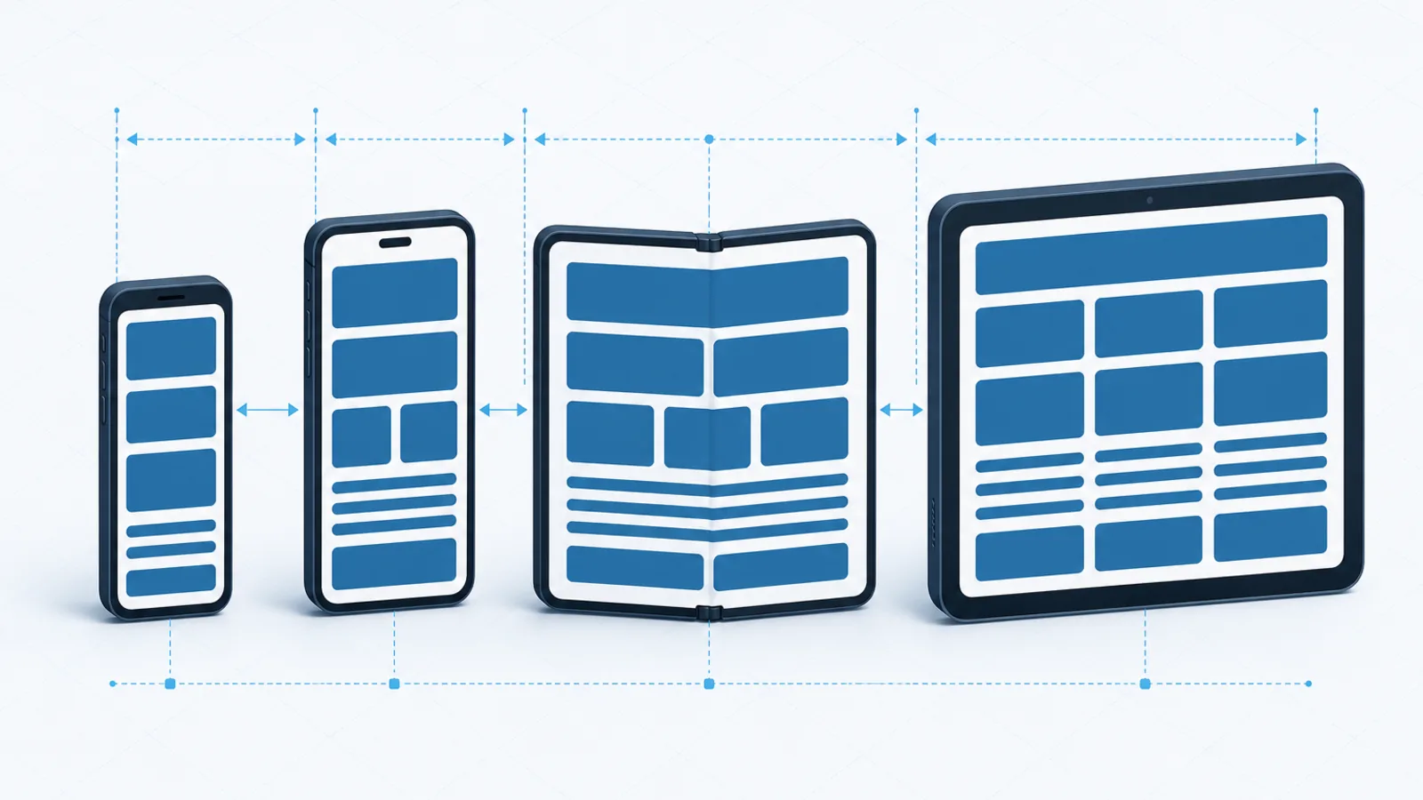
The short version
- Design for content width, not device category. “Tablet” stopped being a useful bucket once foldables and split-screen existed.
- Never read screen dimensions at module scope. They change at runtime, and that single mistake causes most rotation and fold bugs.
- Safe areas are not a notch workaround. They are the only correct way to position content against system chrome.
- Text scaling is an accessibility requirement, and it will break any layout built on fixed heights.
The pitch for React Native is one codebase across platforms. The part that gets underestimated is that one codebase now has to work on a compact phone, a large phone, a phone unfolding into a tablet mid-session, a tablet in split-screen with another app, and increasingly a desktop window the user can drag to any size at all.
Layouts built for a nominal phone break on all of these. This is how to build ones that do not.
Stop thinking in devices
The instinct is to branch on device type. It fails immediately in practice.
A tablet in split-screen has a phone’s available width. A foldable is a phone and then a tablet within the same session, without a relaunch. A React Native for macOS or Windows window is any width the user chooses. Device category tells you almost nothing about the space you have.
Design instead for available content width, and let the layout respond to it wherever it comes from. The questions worth asking are: how many columns fit comfortably here, is there room for a persistent sidebar, and should this navigation be a bottom bar or a rail?
The primitives that do the work
Flexbox, used properly
React Native’s layout engine is flexbox, and most responsive behaviour comes free if you let it. That mostly means restraint:
- Use
flexproportions rather than fixed widths wherever the element should share available space. - Prefer
minHeightoverheight, so content that grows — longer translations, larger text settings — is accommodated rather than clipped. - Use
flexWrapso rows of cards reflow into a grid without any breakpoint logic at all. - Use
gapinstead of margins on children. Supported for some time now, and it removes an entire category of spacing bugs at the edges of a wrapped row.
Read dimensions reactively
The most common source of layout bugs in React Native:
// Wrong. Captured once, at import time, and never updated.
const { width } = Dimensions.get('window');

// Right. Re-renders on rotation, fold and window resize.
const { width } = useWindowDimensions();
The first version works perfectly in development, on one device, in one orientation, and then produces a layout that is confidently the wrong size after a rotation or a fold. Prefer useWindowDimensions everywhere.
Measure the container, not the window
For a component that might be rendered full width on a phone and in a narrow sidebar on a tablet, the window is the wrong reference. Use onLayout to measure the container the component actually occupies, and respond to that. This is the mobile equivalent of container queries, and it makes components genuinely portable across contexts.
Safe areas
Notches, dynamic islands, home indicators, rounded corners and camera cutouts all intrude on the screen rectangle. react-native-safe-area-context gives you the actual insets on every edge.
Two points that are frequently missed. Apply insets to the specific edges that need them rather than wrapping everything — a scroll view usually wants top inset as padding but content that scrolls under the bottom indicator. And insets change with orientation: in landscape, the notch is on a side edge, not the top.
A breakpoint strategy that survives
Define breakpoints once, centrally, in terms of layout capability rather than device names:
const BREAKPOINTS = {
  compact:  0,    // single column, bottom tab navigation
  medium:   600,  // two columns, navigation rail
  expanded: 840,  // list plus detail side by side
  large:    1200, // three columns or a persistent sidebar
};
The values above align with Material Design’s window size classes, which is a reasonable default because they were derived from actual device distributions rather than invented.
Wrap that in a hook, and let components ask what layout they should present rather than how wide the screen is. The intent stays readable and the thresholds stay changeable in one place.
Three breakpoints are usually enough. Every additional one multiplies the states you must design, build and test. If a fourth breakpoint only changes a padding value, use a fluid value instead and keep the breakpoint count down.
Navigation changes shape
Navigation is where responsive design becomes a product decision rather than a styling one.
| Width | Navigation | Content |
|---|---|---|
| Compact | Bottom tabs | One screen at a time, stack navigation |
| Medium | Navigation rail | One screen, wider content, more columns |
| Expanded | Rail or persistent drawer | List and detail side by side |
The list-detail transition is the hard one. On a phone, tapping an item pushes a new screen. On a tablet, it should update a detail pane beside the list. Getting that right means the navigation state has to be expressible both ways — and it has to survive a fold happening while the user is on the detail screen.
Plan for this early. Retrofitting a list-detail layout into a navigation structure that assumed a stack is a substantial refactor.
Text and accessibility
Users can set system font sizes far larger than the default, and a meaningful proportion do. Any layout built on fixed heights will break for them.
- Never set a fixed
heighton a container holding text. UseminHeightand let it grow. - Use
allowFontScalingdeliberately, and only disable it where a numeral genuinely must fit a fixed box. - Cap extreme scaling with
maxFontSizeMultiplieron elements where unbounded growth would destroy the layout — but cap it generously. - Test at the largest accessibility text size. It is where the majority of layout bugs live.
- Keep touch targets at least 44 points, and remember that scaled text does not scale the target.
Testing across sizes
Simulators are necessary and not sufficient. The specific checks worth building into your process:
- Rotate every screen on both a phone and a tablet. Rotation is where
Dimensions.getbugs surface. - Fold and unfold mid-session on a foldable emulator, ideally while a modal is open. Configuration changes during a transient state are where crashes hide.
- Split-screen on Android, dragging the divider through a range of widths.
- Largest text size, on every screen, without exception.
- The smallest device you support, which is usually where content overflows.
- Snapshot tests at several widths, which catches regressions cheaply once the layout is correct.
Boolean Solutions experience with React Native
We build and maintain React Native applications across phone and tablet, and the recurring pattern is an app designed for one phone size that meets its first tablet review two weeks before launch. The fix is rarely difficult in principle — it is fluid layout, reactive dimensions and a navigation structure that can express both shapes — but doing it under deadline across every screen at once is not fun.
Building it responsively from the start costs perhaps ten percent more and removes that entire scramble. If you are planning a React Native build or need an existing one to work properly on larger screens, talk to us.
Further reading
- React Native: layout with flexbox — the layout engine reference
- Material Design window size classes — well-reasoned breakpoints derived from real device data
- Android: supporting foldables — the specific behaviours foldables introduce
- react-native-safe-area-context — the correct way to handle system chrome

Udit Mittal
Founder at Boolean Solutions. Twenty years of building and rescuing web, mobile and AI products for SaaS companies and startups — and writing down what actually worked.
Get in touch